Saturday 30 March 2013
Tuesday 26 March 2013
Wednesday 13 March 2013


Even more Modifications!


FEEDBACK
DPS
Odessa in red on dps
Smash should be SMASH in explicit font
Call an ambulance in a coloured circle
More Modifications!


FEEDBACK
COVER
Move down the text on the right in line with plus
Name people from the posters
CONTENTS
Do numbers on contents in same font as EXPLICITChange the image above the Editors letter for DPS
DPS
Change call an ambulance to red
Centre align Odessa smash..
Lower S for Smash
Align all columns together
Odessa moved slightly to the left
Centralise call an ambulance, looks wonky
AFTER ALTERATIONS FROM FEEDBACK


COVER
No one wants posters of drumers. No one. Pick front men.
ODESSA still too high up, it needs to be where Asking Alexandra is, the bands on the right MUST be the same size as those on the left.
WHAT IS THE DATE KELLY THERE IS NO DATE!!!!
maybe EXPLICIT IN RED
CONTENTS
Can't read the text in blue. Avoid bold. Makes it seem too busy.
Maybe go three columns rather than 4?
DPS
Text beneath Odessa is too wide. Should be no wider than the title Odessa not the three columns
Still dont like the PULL QUOTE font. Try the ODessa one.
Lower case S for songs
Make the drop letter T the EXPLICIT T
Potentially Finished items


FEEDBACK.....
High level 2 low 3 currently.
Masthead font colour makes it tricky to read. Change colour to Red or white.
Remember thirds. Break you page into thirds (horizontally). Odessa MUST be on intersect of the lower third (i.e. 2/3 DOWN the page or directly opposite the lad with the drum sticks). Currently it is way too high
The other text on the cover is MUCH TO BIG. Ideally that should fit beneath ODESSA in the lower third. Avoid page no's on the cover
Add a strap/banner at the bottom of the page about posters which you can find inside.
Contents High level 2 low 3 currently.
Who are Ellie and that Lad?????? put a page no and Band name next to them
Make contents (top right) smaller. Font size 14 will do.
Right align the text in the letter from the editor.
Description of what is in each section MUST BE NO BIGGER FONT THAN 11!!!!!
The contents should be pg 3 or 5. ALWAYS ODD NUMBER
Bottom right explicit and page no FONT SIZE 8-10 NO BIGGER
More NEWS needed
More live reviews needed.
Put exclamation mark after broken guitars
& NOT AND for Rise Alive and Your Poison
Add more hyperbole for New albums and list at least FIVE new albums you'll be reviewing
For opinionated TELL ME SOME SHOCKING THINGS THEY SAY
GIG GUIDE list loads of bands who you are reviewing
DPS High level 2 low 3 currently.
I REALLY REALLY LIKE THE RIGHT HAND SIDE WHY NOT USE THAT FONT FOR ODESSA?!?!?!
You need a comma after Rugby
Make page no's smaller again (see advice on contents)
Who wrote the article. Add the name of author at the bottom not in the top right
Try page no in RED
Put CALL A F'in AMBULANCE in caps and a different font to make it really pop off the page
Not so keen on the font in the article.
Sunday 10 March 2013
Front Cover


I am unsure about the image on the left hand side of the page. I might be changing that feature, however I am unsure.
Thursday 7 March 2013
Double Page Spread.. Half Complete.
 5th of March 2013 update. Half completed.
 7th March update. Article is half done, mast head and description done.
Sunday 3 March 2013


Friday 1 March 2013
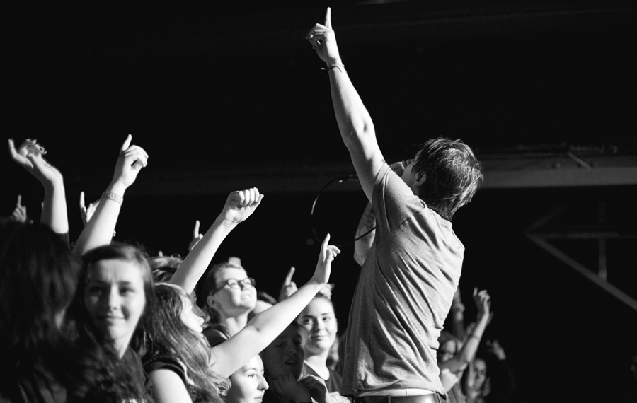
Odessa


I am going to be taking their pictures before their concert at the vault in rugby. The band have agreed for me to use them in my magazine, and to also take images of them during their set. However, I have been doing some research and some contacts in the music magazine business have told me that the best time to take images during a set is during the first 3 or 4 songs. I shall also be taking images of the support bands during their sets, however i am unsure of who they are.
Subscribe to:
Posts (Atom)