Tuesday, 5 February 2013

Artist Profile 2


Zach Oslaw
Name: Rise Alive 
Music Style: Rock / Metal / Screamo / Punk
Influences: Sleeping with Sirens, While She Sleeps, Architects, Blink-182, MotorHead
Members: Matt Groen (Vocals and Guitar), Reece Malcom (Guitar), Dwayne Waters (Bass), Zach Oslaw (Drums).

Artist Profile


KAT MERRY
Artist Name: Your Poison
Music Style: Rock / Metal / Punk
Influences: You Me At Six, Nirvana, Paramore, The Pretty Reckless.
Members: Kat Merry (drummer), Brad Stokes (Bass), Josh Surma (Guitar), Ross Fornam (Guitar), Joe Marks (Vocals).
Style: Modern rock, with hints of old rock. Dark clothing, jeans etc.

Lay Plan for my Draft

Blue fill = Image

Front Cover

Contents Page

Double Page Spread

Monday, 4 February 2013

A Preliminary Front Cover

I decided to make a preliminary magazine using artists which were already well known so that I could focus on what poses would be best for my artists to make and what outfits would collaborate with my theme the best. Also, I wanted to decide on what colour to have my background as I am still unsure. However, I really like the use of a pastel colour as it contrasts to the dark clothes that the artists are wearing. I do not like the cut of the middle side image as I think that it needs to be a full image and I shall then be putting a border on the image and text of a different shade of blue to the background. I really like the font that I used for the artist names, however I do not like the caption to the artists names.

Friday, 1 February 2013

Rock Sound Analysis...


Why did I choose Rock Sound Magazine?

I chose Rock Sound as one of my magazines to analyse due to the vibrant colours on the front and the articles within the magazine. Also the genre of music that they show within the magazine is similar to what music that I want to put into my magazine. Therefore I shall be taking inspiration from the magazine as I feel that it will help me to make my magazine a success.

Layout
I do not like the layout of the left part of the rule of third as it is too bright and does not fit in with the other colours or layout of the magazine. Although it is advertising the other artists within the magazine, I think that they could of used a more pastel colour so that it would not have been too bright, such as blue. However, I do like the positioning of the band and as it is a fairly average positioning of them. However, I do not like where the name of the band is as i think that it should have been lower down on the page. However, I understand why they had to put the writing that far up as they had the positioning of the CD on it. I like the positioning of the mast head as it is traditionally placed and even though the artists heads are covering parts, it is still easily recognisable as to what magazine it is.

Images
I do not like the main image of the band as the members (other than the lead singer) are pushed back behind the singer and I do not like it when the front man is shown to be mainly the only person in the band, and neither do a lot of my target audience. Therefore within my magazine I shall be putting all of the members at a equal distance from the camera. However, if I am able too then I shall just photograph the drummer as the main front cover image as they always get forgotten about within the band and are occasionally seen as the unimportant member.

Font
I like the font of the title of the band, as i think it fits in with the smile on the front mans face as they are both relatively quirky and odd so they collide very well. Also, I like the font of the Mast head, even though I do not like the circle around the 'R' alot, although you can barely see it. Therefore I shall not be using that kind of font for my magazine as it is odd and I do not like the circle. I also like the bold block capital font for the information of the writing, this stands out and is easy to read for the readers and also enables them to understand more about what will be in the magazine even with a quick glance.

Colour Palette
The colour palette for this cover is black, red, yellow and white. I like this choice of colours as it is different to what other magazines would have, as they would normally have three colours, but this magazine has four. I also like the combination of the blue on the strap line and the blue which is hinted on the background of the image, I think that this works really well and ties the cover of the magazine together.

Layout of Contents
I really like that there is the issue number and release month as it highlights which issue is which, just in case that the readers did not see this on the cover of the magazine. I also like that the name of the magazine is printed at the top of the page instead of it being the word 'Contents' as it is obvious that the page is the contents due to the page references and the positioning of the page in the magazine. Also I like that there is a background image as it highlights the obvious main article within the magazine. Also, I like that the rule of thirds applies as it helps the page to be neater, specifically by the writing being on the right, which is not normal, as the writing is normally on the left. Also, I really like that the images are in boxes highlighting double page spreads or posters which are then above two article pieces with the images showing. I like this as it helps to highlight what the most popular or least popular articles within the magazine may be.

Images on the Contents
I really like that the background image refers to an article within the magazine as it shows the clarity of what  the most important article/interview within the magazine is. Also I like that the image is in referral to a live show, which i know that my target audience are very interested in what the shows that they were unable to make it to were like. Also, I like that the double page spreads are highlighted in the rectangular boxes and that there are only two. I like the poses within these images as they are all members shown equally within the band (which i know that my audience would appreciate that). Also, i like that the images below have been cut and pasted onto the magazine, as it still looks neat but it helps to put a bit more information on the page so that it doesn't look too empty or boring. I also like that the poses that they are pulling are natural and comfortable. I also like that the images refer to the text at the side of the page.

Fonts on the Contents
I like that the font which says 'Rock Sound' is bold and not too large, but still noticeable. I think that it is a really good technique to use and would work effectively within my magazine. I also like that the font at the top is the same as the font on the right with the band names as it clearly highlights what bands are in the issue and is very easy to read. However, I am not sure that i like the font that they have used for the information about the articles as it is too small and I would find it hard to read as it is thin as well. I do not think that I am going to use a similar font as I do not want my audience to not be able to read the contents.

Colour Palette of the Contents
I like that the colour palette is simply and only has two colours (white and red) as it is effective with making the writing stand out as the images on the contents are not very bright so it will be easy to read. Also, I like that there is a white background behind two of the images as it helps to highlight them and make them stand out against the dark background. I also like that even though there are only two main colours of red and white, the page is still colourful due to the images on it, such as the band for page 82 in the purple.


Layout of Double Page Spread
I like the layout of the article as even though it has little text, the message is still portrayed clearly and the article is effective. I like that the image of the band is the background and that the text is styled around the member on the left. I would like to use this technique within my article as I think that it is an effective technique and will look good on my piece, although it may be hard to fit the text specifically around my artist, I am going to try it. I also like the positioning of the text 'A Day To Remember' with the block background with writing underneath it. I also like that there is the block background writing on the top of the left page as it gives an introduction to the article. I also like that there is an enlarged quote within the text, I think that this is a good technique and I shall use it if I have an important phrase within my article.

Images on the Double Page Spread
I like the image as it goes across the two pages, I think that this is a very good technique to use as it saves choosing a background colour. Also, I like the shot of the band. In particular the male gaze of the one at the back left (grey shirt) has a male gaze of looking angry, yet his mouth is styled in a comedic way with what you would assume your mouth would look like if you were shouting. Whereas with the man in the middle (Black Top) his male gaze is that he looks happy, yet when you look at his eyes they connote anger or concentration. Also, when looking at the other members of the band you can tell that the overall male gaze is to look angry/shocked which is shown through all of their mouths being open in a specific / slightly similar way.

Fonts on the Double Page Spread
The 'A Day To Remember' print is a version of the bands logo, however, many other bands have this font, and I personally really like this font, so whomever my artist is, I may use it on my double page spread. Similarly to other magazines Rock Sound have used a bold clear font which is easy to read for the title / introduction to the article. Also, they have enlarged the 'Y' which is a traditional aspect of an article. I also really like the font that they have used for the article itself, it is bold, neat and not too thin so it would be easy to read. I am going to use a similar font.

Colour Palette of the Double Page Spread
The main three colours of the article are white, black and light blue. I like this colour scheme as it is not too bold and outrageous, but it still stands out pretty well. Also, I like that the colours do not contrast with the image of the band as I think that it could of been a problem if the colour palette was bright. Also, with the colours not being bright it fits in with my genre of music as pink and bright colours are not associated with the genre and also would not appeal to all of the target audience. I also really like that the blue is only featured within the bands name, therefore highlighting the topic of the band and making it stand out on the image. I like this feature as I feel that it would be very effective and if a potential reader were to flick through the magazine then it would catch their eye.

Analysis of Bauer Media Group

http://www.bauermedia.co.uk/
Bauer Media Group is a multinational media company based in Germany. Owned by the Bauer family as a buisness it has published magazines such as 'Bella' 'Take a Break' and several TV listing titles.
Specifically Bauer media group has published music magazines such as 'Q', 'Mojo' and 'Kerrang!'. I am interested in these magazines as they are similar to the type of magazine which I want to create, specifically 'Kerrang!'.
'Q' magazine started out as originally being named 'Cue', which was named after the cueing a record to play, However, the name was changed so that it wouldn't be mistaken for a snooker magazine. Similarly, the name for Kerrang! comes from a music reference as it symbolises the noise that a guitar makes when you play a chord!

Bauer Media Group would be a good company to publish my magazine as it already has a very good reputation therefore my magazine would do well, but also it would enable the company to have a Rock/Magazine with different roots to Kerrang! even though the genre is the same. I would do this by involving different artists and taking a different approach and do what the readers wanted!

My Potential Mastheads..


I want to have one of these fonts for my masthead, I do not know which one I am going to choose yet as it will depend on the other fonts that I choose. I have chosen these images as they can show the cracks in the music industry, but my magazine is going to try and fix those cracks to re evaluate what genres mean what and to also cut down on the stereotyping.


The name for my magazine came from the image which can be placed on album covers which says 'Parental Advisory Explicit Content due to swearwords or references to sex or violence. I thought that this was appropriate for my magazine as many artists that will be featured in my magazine have had this label on their album before due to explicit language. Also, the word explicit can mean in detail or everything is out in the open, which i am hoping that some of my articles will be like. Also it can be seen as an explicit view/article about a live show so that you know that you will recieve all of the information and be able
                   to know what the atmosphere was like. 

Thursday, 31 January 2013

Explicit Magazine Twitter!

I have creted a twitter account to post some questionnaires and details about my magazine, I am also going to get feedback on some of the posts. I shall link my blog posts to the twitter aswell, and also make my tweets noticable on my blog.

My Pitch!

Fonts I want to use...

Title Fonts.
Action of the time new Font off of: http://www.dafont.com/action-of-the-time-new.font
Decibel Font off of: http://www.dafont.com/decibel.font
American Captain Font off of: http://www.dafont.com/american-captain.font
Tattoo Ink Font off of: http://www.dafont.com/tattoo-ink.font


I have chosen these four fonts for the titles of the pages such as contents. I have chosen these as they stand out and they fit in with the genre of my magazine. This is due to them beinng bold and large (or potentially large). The font that I am most likely to use is the 'Tattoo Ink Font' as I feel that it is the font that links in witht the genre of my Magazine and the type of music that my audience like the most. This is due to the genre of people that will read this are interested in tattoos and body piercings so they will be very familiar with this font, and I am sure that they will like it.

Article Fonts.
Within this article you can find out…Calibri (Body)

Within this article you can find out…Andalus

Within this article you can find out…Book Antiqua

Within this article you can find out…Century Schoolbook
 
I have chosen these fonts as they are clear and bold, there wil not be any troubles with reading the text if it were written in any of these fonts. I am still unsure about which font I am going to use for my magazine.

Analysis of what language I am going to use...

I do not want my audience to feel that they shouldn't read my magazine because they do not understand the language so I shall not be using formal words, however I shall not be using slang unless it collaborates with the theme of the article. I think that this will make my audience want to read the articles more as they would not feel intimidated by the language. Also I shall be using descriptive words to describe everything, especially the live show reviews as I feel that the reader would want a specific explanation of the event.

Another Article that I may use...


Architects Review of Daybreaker.
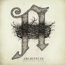
The quintet from Brighton have exceeded the expectations of critics when releasing ‘Daybreaker’ in 2012, with the slight flop of their previous album ‘The Here and Now’ in 2011, it astounded those who did not believe that they could  thrash the views of those who had shunned their previous album. However, Sam Carter (Lead Vocalist) created wonders with his voice throughout Daybreaker, showing his full potential and that the band was not over yet.

‘The Bitter End’ was a quality start to the album. With the long introduction which could put people off, the quintet throw those who would not agree totally away, with the powerful lyrics even after a fairly dull introduction. However, the pace of the song picks up and slaps you round the face with the image of a committed crowd joining together in chanting the small quantity, but excellent quality of lyrics. A truly powerful song and an overwhelming introduction to the album.

With ‘Alpha Omega’ I can easily predict for it to be amazing to be played live, with the catchy melody a third of the way through, it creates images that the quartet will most likely tear the roof off when it comes to playing that song live, whether it be headlining a concert, or even a small tent at a festival (which would be unlikely).

The guitar skills in ‘These Colours Don't Run’ can blow your mind away; they extend your understanding of the song, which is powerful without fault just like the other songs off of the album. Just like ‘Alpha Omega’ it is most definitely going to be one of the highlights of seeing the band live.

‘Daybreak’ as I predicted is the storm within the album, the lyrics, the vocals, the rhythm and pace are all outstanding. With being the premiere track within the album there is no wonder that this is the song which makes me want to get up and mosh around my dining room even more than the others!

Within ‘Truth be told’ the waved pattern of the pace interrupts the focus of the person listening, as the slow pace does in fact help to show the message, I highly doubt that the ballad form within this genre of music would be a massive hit. However, when the guitar riffs and the pace pick up, it becomes a song which could easily be stuck in your head due to the catchy lyrics every so often within it.

‘Even If You Win, You're Still a Rat’ Wow. What. A. Song. The mind-blowing-breath-taking-jaw-dropping song came as a total shock to me. Yes, the previous tracks had been amazing, but this is a song I would have on repeat for countless days on end and never get tired of it. It is cleverly crafted and exhibited to a point where even other songs on the album do not even seem like they have been created by the same artist.

To me, ‘Outsider Heart’ did not live up to the other songs on the album. This was down to it just not appealing to me, in such a way that the lyrics did not stand out to me. Also, how the rhythm and music were not amazing, but the vocals were up to scratch, as expected. Although parts are catchy and could be part of an excellent live show, I do not predict that it would be a song that most would be really excited to see live. However, with the catchy verses as I listen to it more, it does grow on me, yet I still do not think that it lives up to other songs on the album.

With the slow paced ballad ‘Behind the Throne’ I was not sure of my opinion at first, but then I listened to it again, and it helped me realise the risk that the band was taking. The vocals when Sam cuts into his own singing with a rougher tone are brilliant, it may be similar to what I have previously heard, but he executes it excellently. Throughout the song I was waiting for the pace to suddenly lift to something like their other songs on the album, a style which they have shown before. This did not happen, which lead to disappointment. Therefore, I cannot see it being a massive hit at a live show, just like ‘Outsider Heart’.

‘Devil's Island’ fitted perfectly into the genre and theme of the other songs on the album, again I cannot fault the vocals or talent of the band, it was all brilliant. This song would slot perfectly half way through a set list or a playlist; however, I do not think that it is as good as other songs on the album to be a show opener or closer.

‘Feather of Lead’ has got to be a joint second with ‘Even if you win, you’re still a rat’ for me. As it is easily compatible to the other songs, but has that slight edge over them due to the riffs and catchy lyrics, I cannot fault it. It is one of those songs which Architects have managed to conquer, a song which makes you want to mosh around the oddest of places and not care about a thing.

What a perfect way to end the album with ‘Unbeliever’. The ballad was outstanding; this would be the perfect end to a set. The lyrics were so beautiful and meaningful, probably not what you want to here, but trust me, it’s brilliant. The way that the form of the song changes half way through emphasises the meaning and intensity of the song, I cannot fault it. Most definitely my favourite song of the album!

I loved this album and I would recommend anyone who hasn’t listened to it before. I myself was not a fan of the band before listening to this album, but I will definitely be keeping it on my playlist! Totally worth a buy!

9/10 Rating.

An Article that i may use...


                                                      YOU ME AT SIX – THE FINAL NIGHT OF SIN
The pyrotechnics were astounding. The atmosphere was astounding. The crowd was astounding. The teasing that the band did at the beginning of the concert however was not. My ear drums were bust from the girls screaming getting over excited. Obviously a lot of newcomers who were at their first live show. This was to be expected with the recent gain of fans due to their upcoming ‘fame’.

The lighting within the show was perfect for the songs in which they were associated with, however, they did not play well with cameras or phones as the majority of images that I have seen have been pretty shabby. But I guess that is what the live video is for!

The night was a success in anybody’s eyes, I even think that the bar staff had a brilliant night, much more than what they would have had if the X-Factor had booked it like they were supposed to. Which of course, the frontman Josh Franceschi did mention. Along with adding that someone had said that ‘Rock music was dead’ and then went on to say ‘Does this look like Rock music is f*cking dead?’ to which, of course, there was a massive roar from the crowd who agreed with him, although I do wish that he’d of defined which part of the rock genre they fitted in with, because obviously they are not heavy rock!

The song choice of the concert was a little bit flimsy. This was due to the band playing a lot of old songs, not just songs off of ‘Sinners Never Sleep’, such as ‘Liquid Confidence’ and ‘Playing the Blame Game’. You could both hear and see that people were not too familiar to their old music, which was a shame to me because I was hoping that the crowd would be in awe that they did old songs, due to them not touching many old songs off of their old albums on the tour in March of 2012.

Josh Franceschi definitely proved his right to be a frontman; however this did leave me disappointed that not once did the other members (Dan Flint, Max Helyer, Chris Miller and Matt Barnes) communicate towards the audience besides a little showing off of their instruments when Josh introduced them. It would have been nice to hear them appreciate selling out Wembley Stadium.

A highlight was also when Josh said that he wanted nudity in the live video. This immediately caught my attention, as did it the Mother of two 11 year olds in front of me who did not look impressed. But what did she expect? To know that someone has the power to get thousands of people to strip off for a song left me in awe.

Crash. What can I say? I did fall down with the jaw dropping performance of not only the band, but the crowd as well. I will never witness anything like that for a long time!

My rating: 9/10

Colours which I want to use...

I do not want to have bright colours on my work as I do not think that it will tie in with the theme very well. Therefore my colour scheme will be mainly monochrome except the important information on the cover or contents etc. That would be blue as i feel that it is a relatively unisex colour and no one would be bothered about that colour choice.
On the cover of my magazine i am going to chose the background colour according to what the group that i photo and their clothing as i do not want to contrast the colours too much nor do i want the colours to look awful and not attract the audience.

Images and Videos of Artists which have Inspired me for my Magazine...


Older inspirations...


More recent inspirations...


Examples of other texts...